Friday, 22 April 2016
Tuesday, 15 March 2016
Thursday, 10 March 2016
AUDIENCE FEEDBACK
Today, we gathered a significant amount of audience feedback from my target audience on all the final pieces of work my group has done which included the music video, magazine advert and digipak. Overall the comments were generally positive however there were things that could be improved upon in order to enhance the quality of each product.
In the following video we interviewed 2 students who are a part of my target audience and asked them what they thought of each product. We used the popular Snapchat to advertise my products to them and we also filmed these interviews using Snapchat.

In the following video we interviewed 2 students who are a part of my target audience and asked them what they thought of each product. We used the popular Snapchat to advertise my products to them and we also filmed these interviews using Snapchat.
In one of the private interviews we had with my target audience, someone commented 'great performance, really understood the emotion'. This was because throughout the video they were able to get to grips with the message through the facial expressions and body language used by the performers, and understood the tone of the song. However, we did receive comments on how certain shots were too 'shaky' and that I needed steadier shots in order to enhance the quality of the video. This is what we found difficult as the location in which we shot was in London on a weekday and we didn't have much time so we needed to make sure that we got the shots captured quickly. As a result of this, the shots were filmed handheld and not on a tripod or dolly, thus appearing 'shakier'. Nevertheless they enjoyed the narrative of the music video as they were able to see the flashbacks of the couple the video was based on compared to how they are now, and it took them on a mysterious journey of their good times.
The indie rock style that we wanted to portray was praised in the digipak, as the leaves and the black and white effect on the images really emphasised our bands image, The text was seen as very 'artistic' as the font looked as though it had been handwritten with a ball-point pen which made it very 'authentic and down to earth'. The use of the leaves really outlined the the title of the album, 'Wondering Souls', as the leaves have that feel of 'mother nature'. Moreover, the advert was found to be really effective as it proved to them that our music video was worth watching because of the reviews of big critics such as The Daily Mail. In addition they liked the image on the advert as all the band members wore sunglasses outside in an open field which indicated to them that we have nothing to hide, as we're out in the open, but have more to our personalities, as the eyes were covered.

The indie rock style that we wanted to portray was praised in the digipak, as the leaves and the black and white effect on the images really emphasised our bands image, The text was seen as very 'artistic' as the font looked as though it had been handwritten with a ball-point pen which made it very 'authentic and down to earth'. The use of the leaves really outlined the the title of the album, 'Wondering Souls', as the leaves have that feel of 'mother nature'. Moreover, the advert was found to be really effective as it proved to them that our music video was worth watching because of the reviews of big critics such as The Daily Mail. In addition they liked the image on the advert as all the band members wore sunglasses outside in an open field which indicated to them that we have nothing to hide, as we're out in the open, but have more to our personalities, as the eyes were covered.
Here are some values that represent the amount of people that liked each product out of 110.

Tuesday, 1 March 2016
Friday, 26 February 2016
CONSTRUCTING THE ADVERT
In order to construct the Magazine Advert we had different images to chose from in order to form the main image of our music video. In our mind, we thought that the image that we would use would be in a portrait image.
Here are some of the image we were deciding on:


Here are some of the image we were deciding on:


We decided that we would use this image, because it has all of the band members in the image, and it would also be a great image to manipulate. So this includes changing the image size, by cropping it or making it smaller or larger. It would also be a good image to change the effect, so we could change it to Sepia or Black and White. In our case we decided to change the image to a mixture of Black and White and Sepia.

We felt that this type of image would suit best when it comes to it relating to the title of the single, "Wondering Souls".

Next it came to inputing the title of the band, the title of the album, and all the other relevant information. So when it came to deciding this, in mind we had to think of the type of font that we were going to use and the font size of the text. And we came to the decision that we was going to use the Font Edwardian Script ITC, this was for the Title of the band which was 'Forgotten Kings'.

And for the title for the album single we decided to use a different font, because we felt that if we used the same font twice then it would make the advert look a bit repetitive. So we decided to use the font Century Gothic, which was used for our album single 'Wondering Souls'
Then we decided to add other things, just to catch the audiences attention, such as the fact that we got 5 stars from companies such as Kerrang, Daily Mail and NME, and this was the same font as the album single.
And lastly we put out the relevant information as to how and where the single can be downloaded, and we also included our website on the advert so that the can check out our web page.

And this was the constructing of the Magazine Advert.
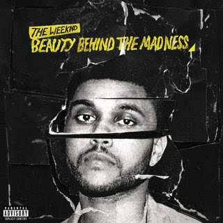
We mainly got outr influences from Magazines Adverts such as The Weeknd, ColdPlay and The Krooks. Their music advert also had the is dark theme to it.


FINISHED ADVERT

Here is the finished advert for our music single. This was done using Adobe Photoshop!
INFORMATION ABOUT THE ARTIST

The song we chose 'Kink In Your Soul' was from the British band 'Red Emperor' who are from Brighton aged 18-22. They are a 4 piece Indie Rock band and they have an EP which is currently available on their website. The video on their YouTube Channel with the most views is the official music video to their hit song, 'Kink In Your Soul'. The members of the band include:
- Edward - www.twitter.com/EdwardBedford
- Charlie - www.twitter.com/C_Herridge_
- Mollis - www.twitter.com/iamollis
- Navraj - www.twitter.com/NavrajManku
They also have a soundcloud page with a following of 117, which is surely bound to increase with the success of their hit song.
Here are some screen grabs of their YouTube and Soundcloud Page,


Tuesday, 23 February 2016

Monday, 22 February 2016
Tuesday, 9 February 2016
Friday, 5 February 2016
THE MAKING OF THE DIGIPAK
Today we started creating the digipak for our band's album. We were first given a lesson on digipak's and learned what their purpose was along with what's included in one, I did a blog post on this earlier. Also we took a look at some artists' digipak to help us generate the creativity to produce our own. I noticed that Rihanna's digipak focused much on her face and body. The whole of Rihanna's digipak has a strong red input such as her lipstick and roses, which connotation love and lust to create a sexy but sweet image at the same time. In order to create this digipak we had to take photos of those who were in the band which were myself, Jordan and Dafe. However, during the time of the photoshoot Dafe (the drummer), was absent and had to use someone else who was of similar build in the photos. Our group agreed that we wanted to have really clear and crisp photos for the digipak and our teacher had a Canon Digital SLR camera she was willing to let us use. Following this, we took the images the next day outside in a mellow atmosphere that truly connected with nature and the image of our band. Also I brought into school my acoustic guitar for the shoot so Jordan could take some photos with it as he's the guitarist of the band. Here are some of the raw images from the shoot.


As you can see the raw images have come out as expected, nice and clear and straight after this we went straight back up to the classroom and began editing to make the digipak. The editing process for the digipak was a long one as we had to be taught how to use the software Adobe Photoshop, thus at the start the editing was quite slow, As we started to consistently use the software we found that our skills improved as editors and were able to edit to a good level. Firstly, whenever an image was uploaded to photoshop we noticed that the dimensions of the image were not that of a digipak so inorder to get started we needed to change the dimensions of the photo. Also during editing we had to ensure that when decreased or increase the size of the photos we had to hold the 'Shift' key so the proportion of the image doesn't change. If the proportion of the image changed then it would look distorted and irregular. We were taught that in order to add any edits to the image we would first have to create a new layer and label it with the intended edit. This was to make sure that if we wanted to remove that particular edit later, we would be able to do so with no fuss. This meant that in order to add a 'Black and White' effect I had to create a new layer and label it that. Below are some of the images I took during the editing process of the images.


As you can see the raw images have come out as expected, nice and clear and straight after this we went straight back up to the classroom and began editing to make the digipak. The editing process for the digipak was a long one as we had to be taught how to use the software Adobe Photoshop, thus at the start the editing was quite slow, As we started to consistently use the software we found that our skills improved as editors and were able to edit to a good level. Firstly, whenever an image was uploaded to photoshop we noticed that the dimensions of the image were not that of a digipak so inorder to get started we needed to change the dimensions of the photo. Also during editing we had to ensure that when decreased or increase the size of the photos we had to hold the 'Shift' key so the proportion of the image doesn't change. If the proportion of the image changed then it would look distorted and irregular. We were taught that in order to add any edits to the image we would first have to create a new layer and label it with the intended edit. This was to make sure that if we wanted to remove that particular edit later, we would be able to do so with no fuss. This meant that in order to add a 'Black and White' effect I had to create a new layer and label it that. Below are some of the images I took during the editing process of the images.


MUSIC VIDEO ROUGH CUT
Here is the rough cut of our music video, and we gained some audience feedback in order for us to build our music video to make it better.
Tuesday, 2 February 2016
Monday, 1 February 2016
FIRST DAY OF EDITING! - ROUGH CUT
First Day of Editing! - Rough Cut
Taju started on the editing for our rough cut today after 2 days of filming the different scenes. He was able to edit the whole video in about 5 hours without using any effects. He used the speed tool increase/decrease the speed of certain clips to match the mood of the scene in the music video. He also used the layering technique that he learned whilst doing the lip sync exercise in which he would layer each clip that involved singing on top of one another. From doing this he would select the best clips for that specific point in the music video. Throughout the music video there is one medium shot that will act as the foundation of the music video and will be shown when any close-ups or Party/London shots aren't. I placed this medium shot in the 'Video 1' slot on the timeline so it is the main clip throughout the video.


Here are some images of hisediting process.

This image shows the video after he selected the each of the segments he wanted from each individual clips.

Monday, 25 January 2016
ANIMATIC
This is our animatic for our music video, it was made by Taju Deen, he completed this using Adobe Premier Pro. He had a digital camera and took pictures of each individual image that we drew of our music video. And then he imported it onto a Mac computer and he edited it.
And above is the outcome, there's our animatic.
Friday, 22 January 2016
Monday, 11 January 2016
Subscribe to:
Comments (Atom)